
DepotRX: Google UX Case Study #1
The Purpose of this project was to design an app and responsive website that help medical office staff efficiently order and track supplies. Many existing medical software systems are outdated and difficult to use, making inventory management frustrating and error prone.
DepotRX addresses these challenges by providing a simple, intuitive interface that enables doctors and staff to organize inventory, place orders, and stay informed with confidence and ease.
BACKGROUND
Designing a medical app that allows nurses and doctors to easily purchase medical supplies without technology frustrations
GOALS
Easily order medical supplies, track inventory, understand their thought processes, which is used more often
TIMELINE
4 weeks, September 2025
GOAL STATEMENT
Our medical supplies app will let users order and track medical supplies and inventory, which will affect medical personnel and staff by allowing them to purchase medical supplies and keep track of their inventory.
We will measure effectiveness by tracking the supplies ordered with real-time tracking.
OVERVIEW
Designed a medical inventory tracking app that is simple and easy-to-use for those in medical offices

COMPETITIVE RESEARCH
Compared four similar companies for General Information, First Impressions, Interactions, Visual Design, and Content


PERSONAS
Designed two personas or fictional users whose goals and characteristics represent the needs of a larger group of users

")
USER JOURNEY MAP
Goal: Use an app to easily purchase medical supplies for non-tech experienced users
 1")
BIG PICTURE & CLOSE-UP STORYBOARDS
Big Picture Storyboard focuses on the user experience by considering how people use the product throughout the day and why it is useful, Captures users’ actions that push the story forward

Close-Up Storyboard focuses on the product and the “what.” What happens on each screen? Where are there problems in the flow? Not a click-by-click walkthrough

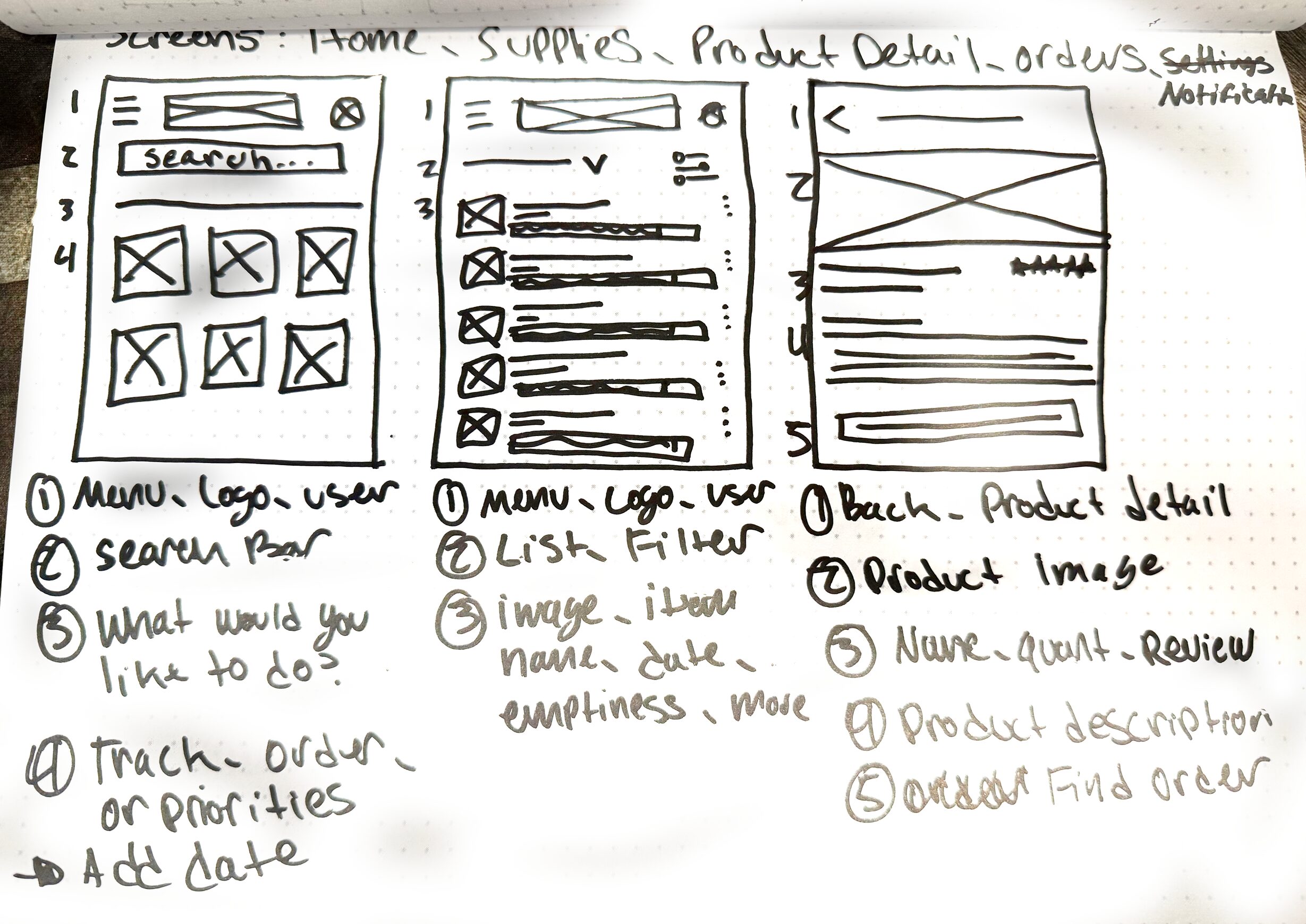
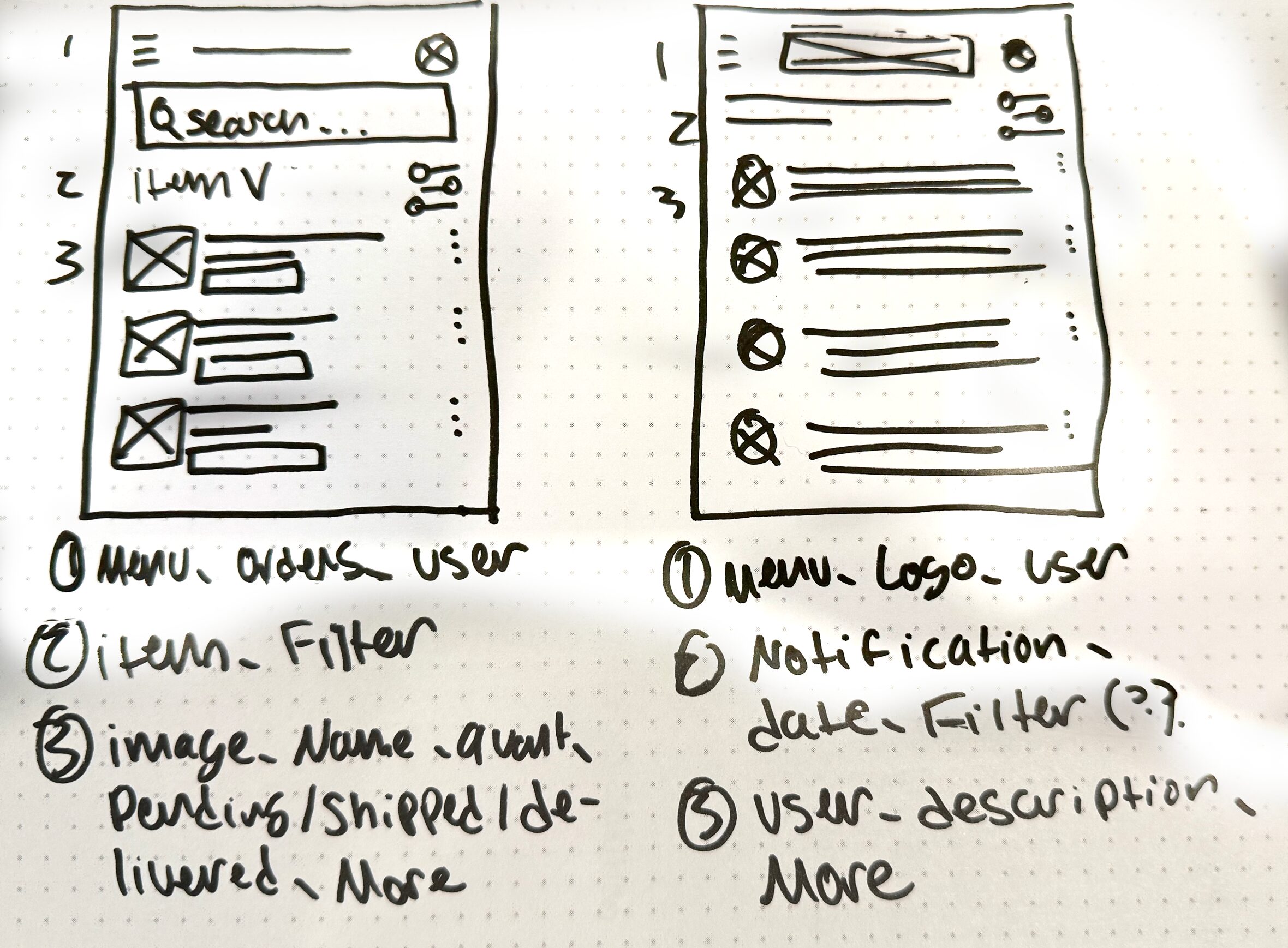
PAPER SKETCHES
The goal of the paper sketches was to get out ideas quickly while keeping the purpose of the content and user as front and center of the designs
DIGITAL WIREFRAMES
Translating paper wireframes to digital wireframes
Initially, I was going to provide a way for users to be able to purchase medicine directly through the app but I decided to allow a list of suppliers for price options as this is an app for inventory management.

STICKER SHEET
A collection of elements and components that make up part of the design system

PROTOTYPE
Translating digital wireframes to a completed design and prototype
The digital wireframes were helpful to understand where the issues were within my design. Once I completed prototyping the digital wireframes, I was able to see which screens were necessary for the user and which weren't.