
The Hunt: Google UX Case Study #2
People often struggle to decide what to cook with the ingredients they already have at home. They waste time searching through multiple recipe sites, only to find dishes that require extra shopping or don’t fit their preferences. This leads to food waste, frustration, and uninspired meals.
Over the course of 3 weeks, I designed a platform that allows users to input ingredients they have at home to help reduce waste, reduce time in the kitchen, and discover new recipes. The Hunt is a recipe finder platform that helps users find recipes with ingredients they have at home.
BACKGROUND
Design a responsive website where users enter a list of ingredients and find recipes based on said ingredients
GOALS
To design a responsive website that helps users discover recipes based on the ingredients they already have, make meal planning easy, and reduce waste.
TIMELINE
3 weeks; September 2025 - October 2025
USER RESEARCH
A Pain Point is any UX issue that frustrates and blocks the user from getting what they need

DECISION FATIGUE
Users spend too much time trying to figure out what to cook and end up making the same meals over and over

INGREDIENT WASTE
Food often goes bad because users don’t know how to use leftover or random ingredients effectively

RECIPE OVERLOAD
Most recipe sites are cluttered with irrelevant results or long blog posts, making it hard to quickly find something practical.

PERSONALIZATION
Recipes rarely match what users actually have at home or their dietary preferences, forcing extra grocery trips or substitutions
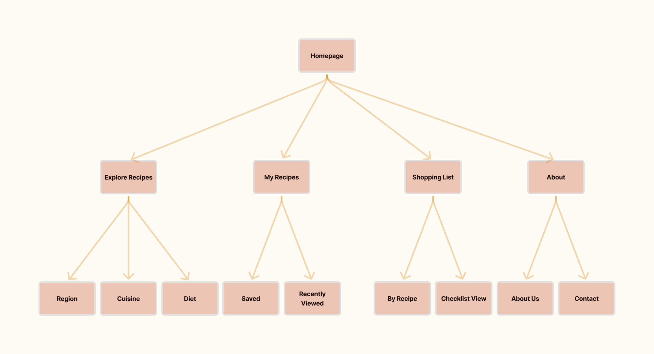
SITEMAP
The sitemap includes each tab of the website as well as their corresponding elements
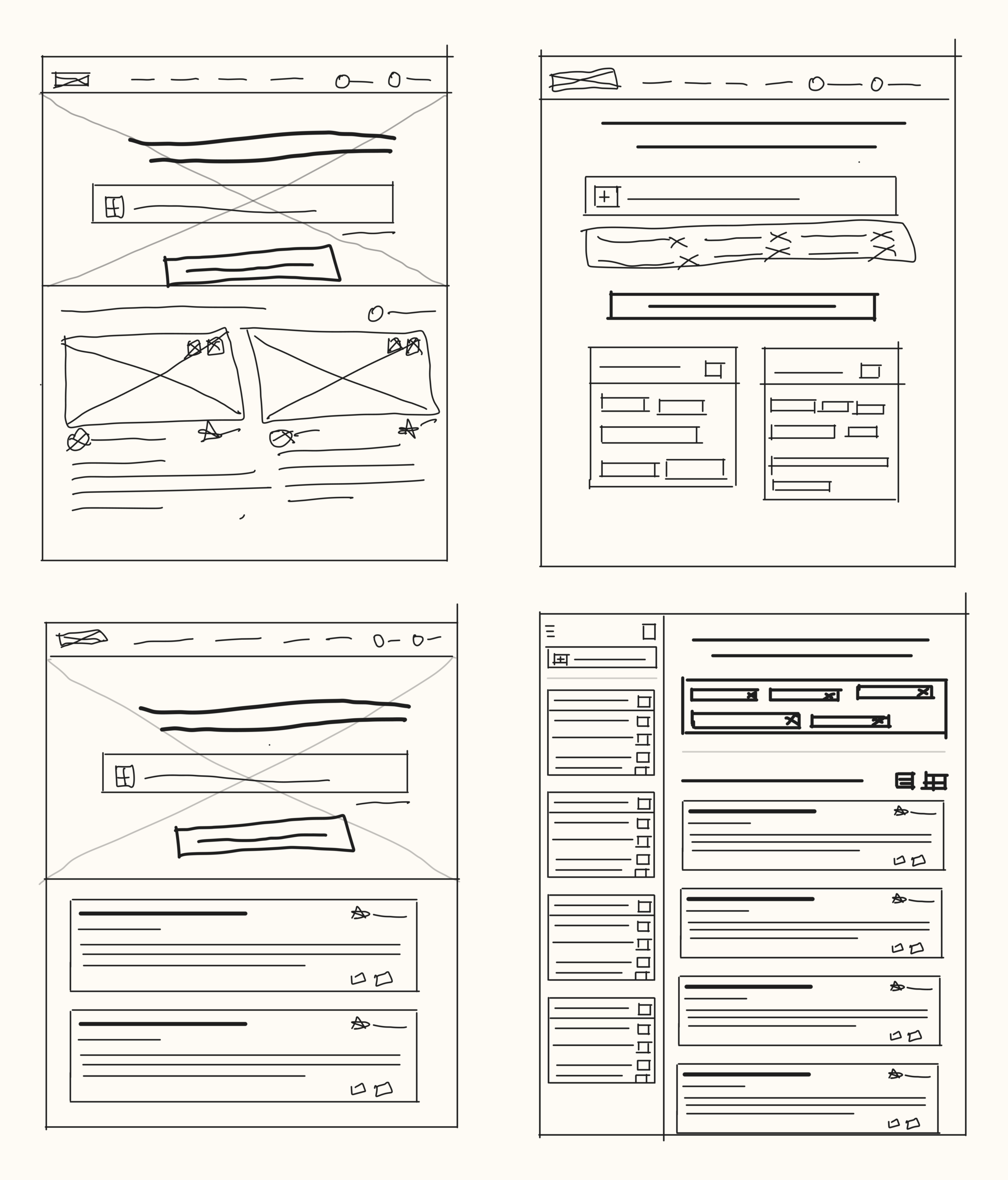
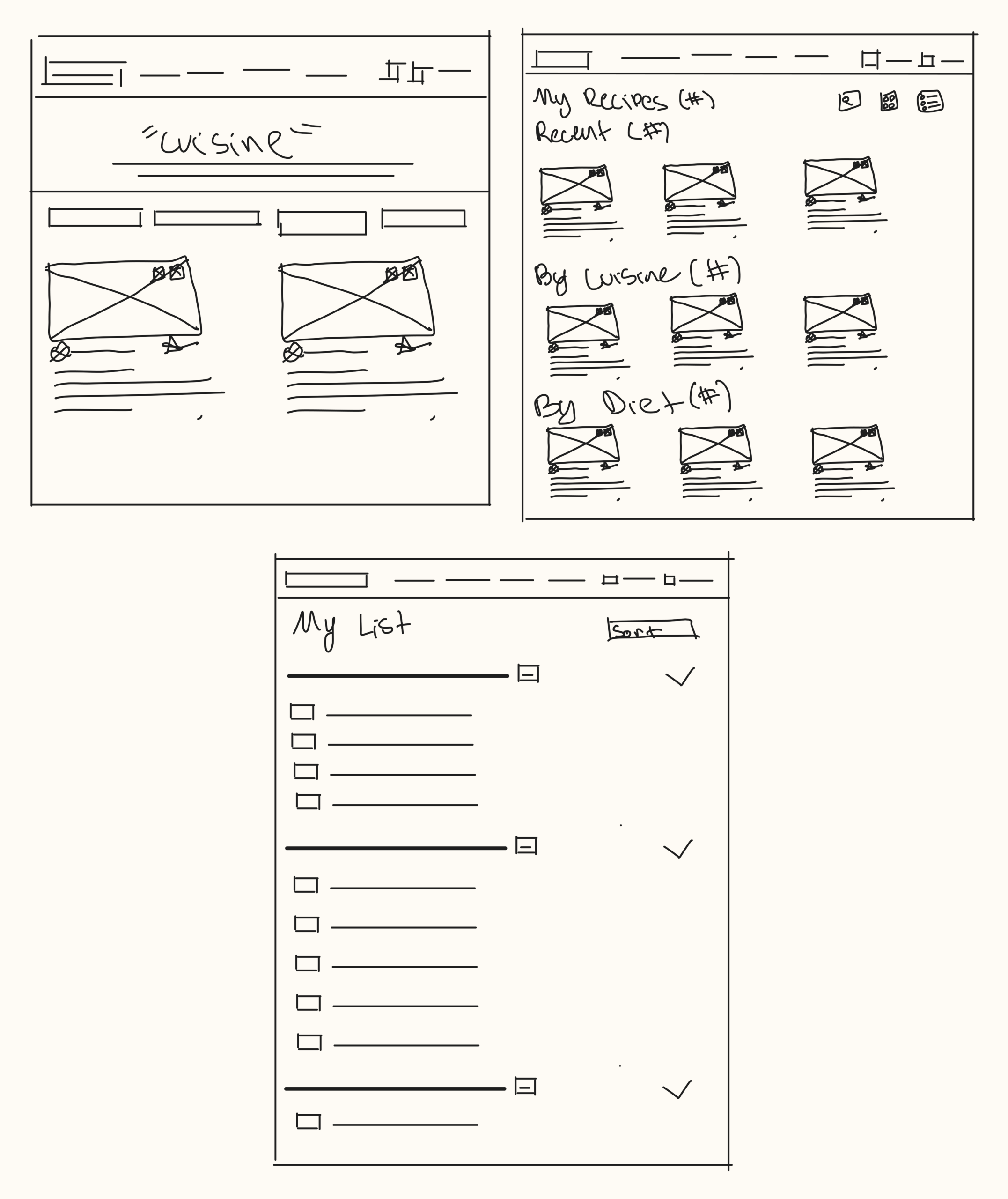
PAPER WIREFRAMES
The following paper wireframes include each screen and multiple iterations of the home screen
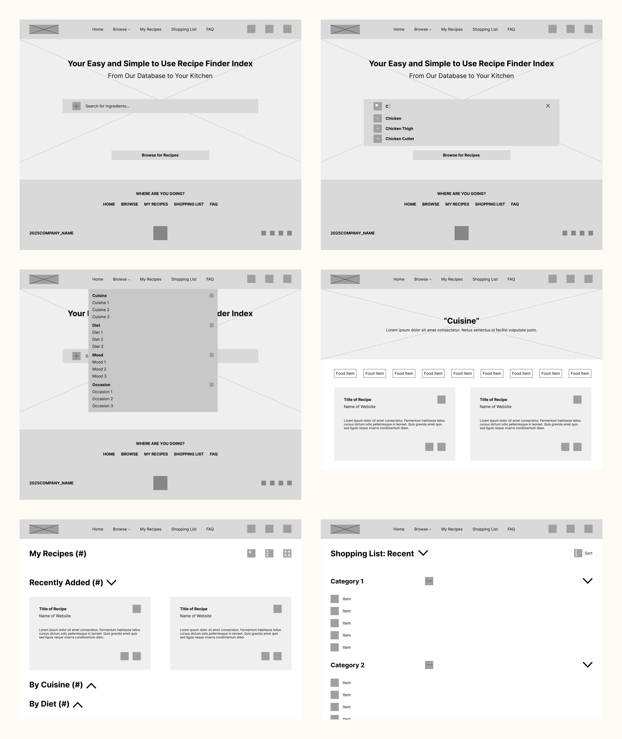
DIGITAL WIREFRAMES
After sketching the initial screens, I digitally placed the screens into a wireframe with minor changes.
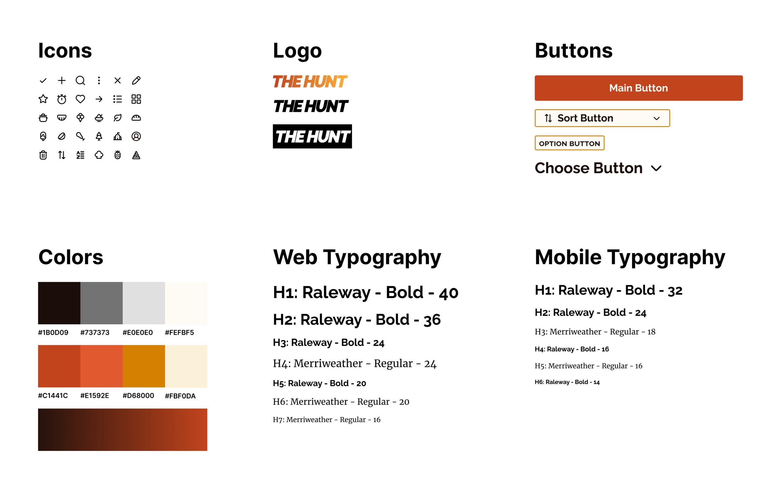
STICKER SHEET
The color scheme represents fire while the fonts provide a readable but classy aesthetic to the 'cooking' themed platform
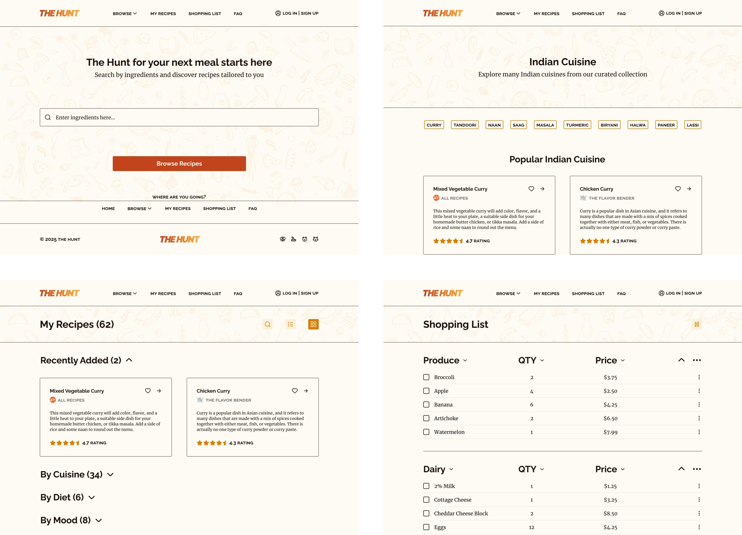
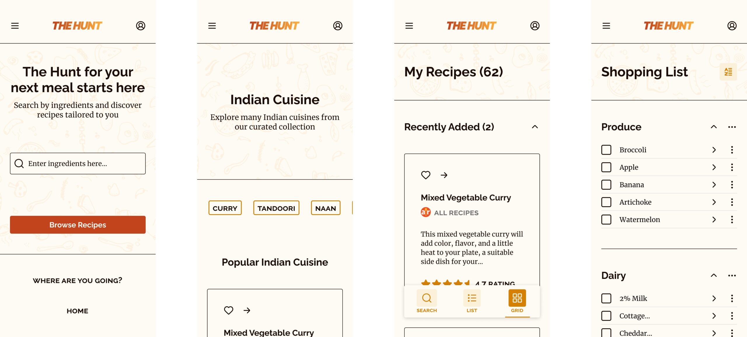
WEB & MOBILE MOCKUPS
The website mockup features the 4 main screens of the platform: Home, Browse, My Recipes, and Shopping List
HIGH-FIDELITY PROTOTYPE
The following video showcases the final prototype and design of the platform
TAKEAWAYS
IMPACT
In this study, my plan was to design a platform that would serve as a recipe finder. As I studied my competitors, I got ideas for more features I could use to enhance the platform for my user.
WHAT I LEARNED
I learned the importance of competitive research, WCAG guidelines for accessibility, and managing and organizing pages with Figma.