Workarise • Project Management Software
What is Workarise?
Workarise is a project management software that helps users track and manage their projects. Workarise includes a Gantt Chart, Kanban Board, Calendar, Inbox, Team Member List and Card view, White Board, Time and Expense Tracking chart, and Issue Management Tracking. I was assigned to design and prototype Workarise’s platform based on the information above. I started working for Workarise in August of 2022. From there I took the necessary precautions to understanding project management software and comparing Workarise to its’ competitors: Wrike, Monday, and Asana.
My first design began with the home page. The Home page consists of a project view, list of team members, calendar, inbox and messaging system, gantt chart and task overview. The initial design did not have a solid grid system and so overtime I rearranged the components of the home screen. The first design can be seen in the first image, Home – October. Once I developed a solid grid system in Home – November, I changed the project overview component to include a list view for users to see it in one view. I also got rid of the inbox system and changed it to an instant messaging component.
The final design, Home – January consists of a card and list view for the project overview component and a cleaner calendar view. Designing the home page was more about was is necessary for users and having the information that they would want to see when logging on for the day. As I designed and researched this project, I was able to understand project management in a better sense, while also understanding users needs and wants.
Home • October
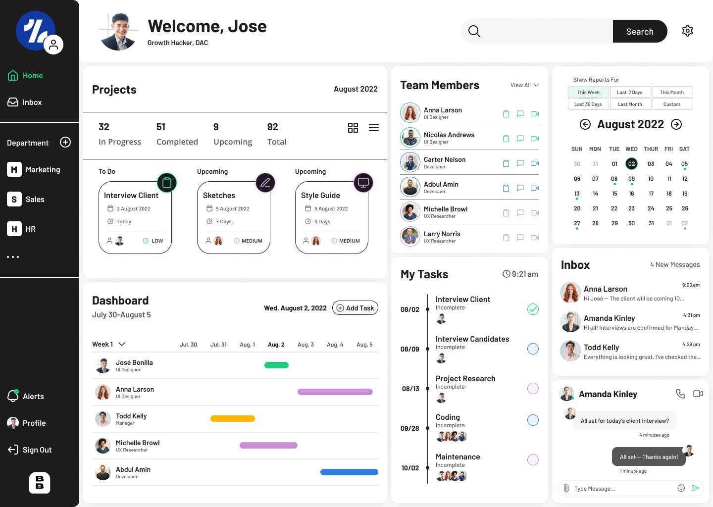
Home • November
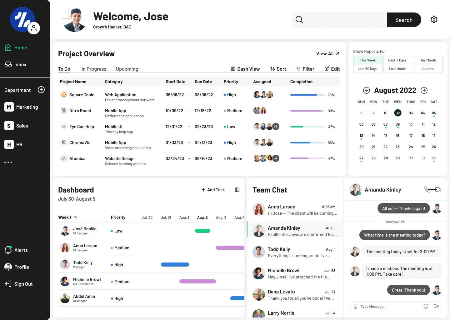
Home • Card View • January
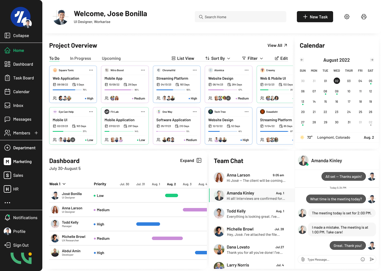
Home • List View • January
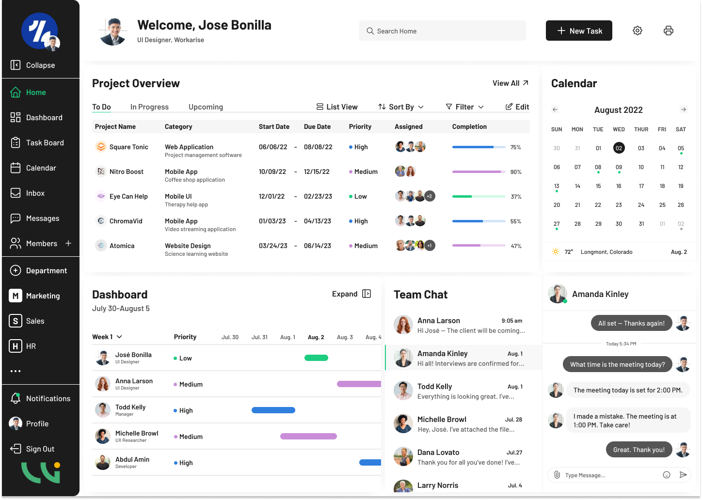
Gantt Charts
One of the main components to project management software is the Gantt Chart. A Gantt Chart is a visual that shows users their project tasks over a scheduled period of time. A Gantt Chart is used for project planning which is why it’s so important for project management companies to include them in their software. Gantt Charts typically include the Task Name, Start/End Dates, Duration, User Assigned, and Priority.
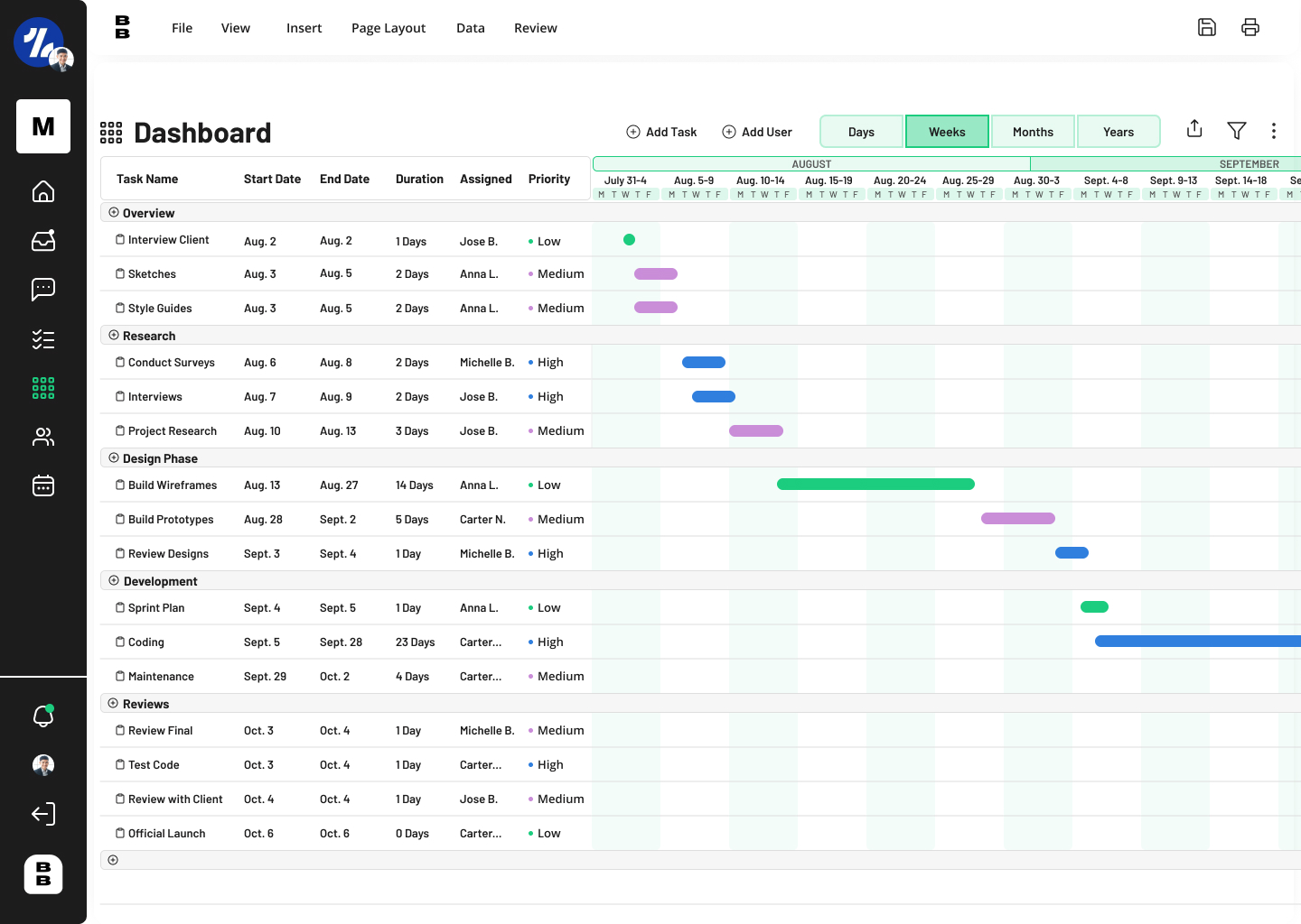
When designing the initial Gantt Chart, I started with naming each project phase such as, Overview, Design, Development, etc. Then I began assigning each project phase their own tasks. Each visualization in the calendar view of the gantt chart contains its priority color so users will know that that task has either a low or higher priority. My initial design, Gantt – October contained harsh strokes and lack of color. There is a lot a user can do in a gantt chart and the initial design lacked the capability for a user to have control.
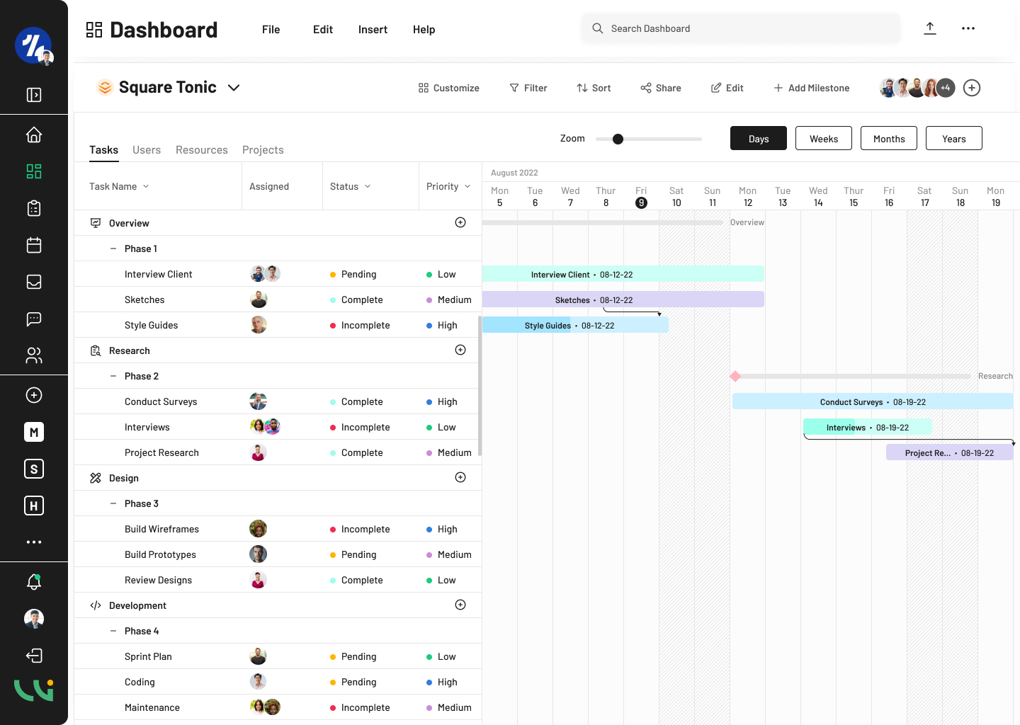
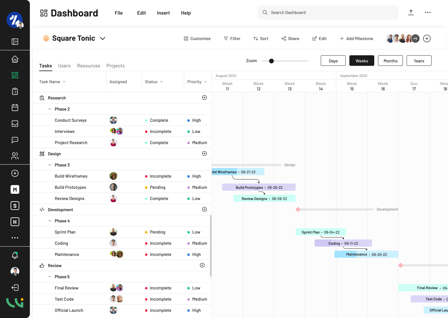
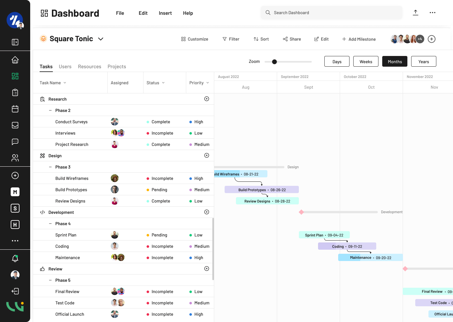
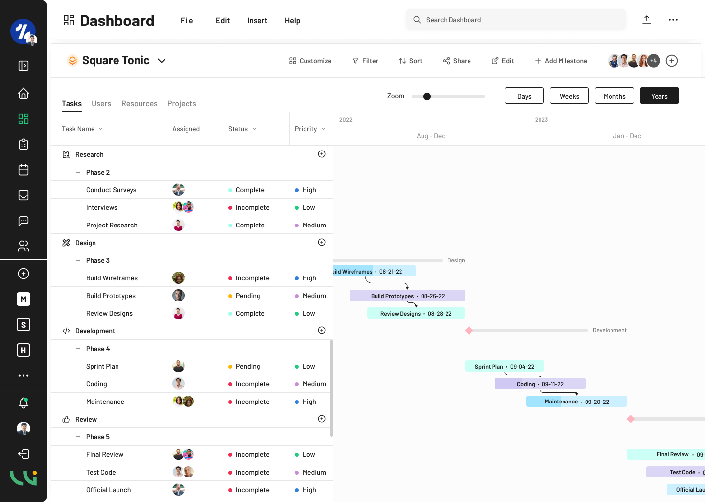
My final design in Gantt Tasks – January contains many elements and templates for users. The final result was a major improvement compared to the original Gantt Chart. First, I rearranged the page of the dashboard to include options for users to customize, filter, and sort the chart. The “Square Tonic” in the left corner is the project name. Users can click on the project name to change to a different project and view those tasks. I added different template options: Tasks, Users, Resources, and Projects. Information is sorted out into its own chart to be better organized and keep the information simpler for the user or project manager.
The chart table contains the Task Name, Assigned, Status, and Priority. I took the dates out of the chart and placed them on the components in the chart’s schedule. I lightened the colors to make it more appealing to the eye and added arrows that flow to the upcoming or next task. Milestones are another main component in a Gantt Chart. It’s important that a user knows where and when they hit a milestone. Milestones are the pink diamond located on the next project’s phase. I studied the Agile Methodology which is a key component in project management. Dividing tasks by phases allows more smooth transitions when taking on such a large project.
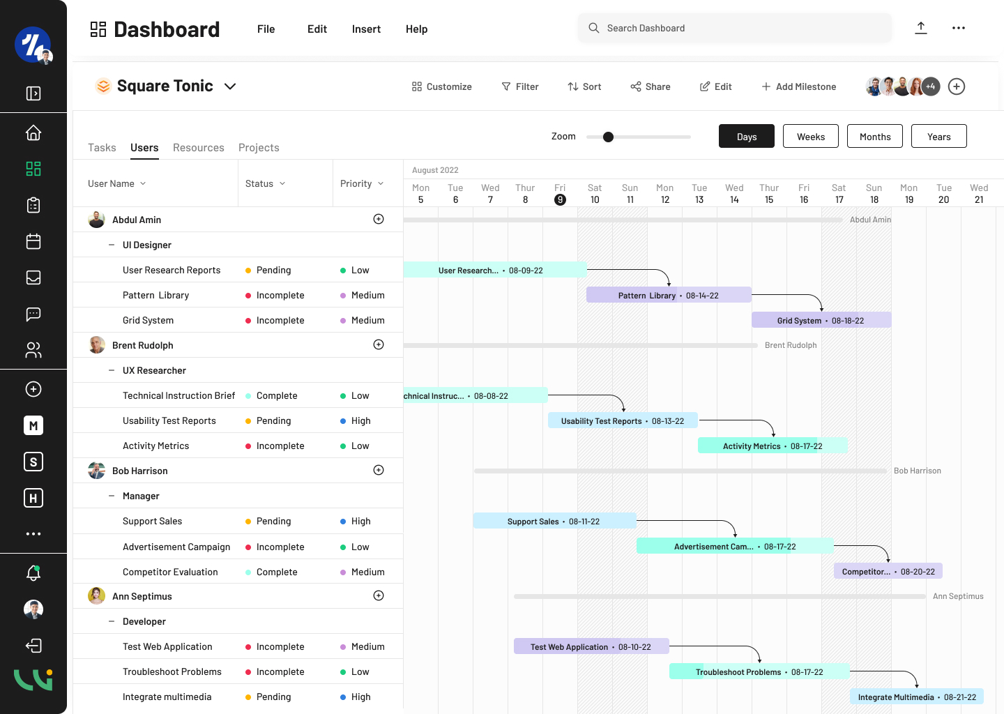
The second template of the Gantt Chart, Gantt – Users focuses on the individual’s tasks and milestones. The table contains the user’s Position, Task, Status, and Priority. This template allows project managers to view each individual user’s accomplishments and schedule. While milestones in the Task Gantt Chart are used for project phases, milestones in the Users template are used for each users’ personal milestones. The User Gantt Chart tracks users in a specific project, such as Square Tonic, which can also change to a different project when a user clicks on the project’s title.
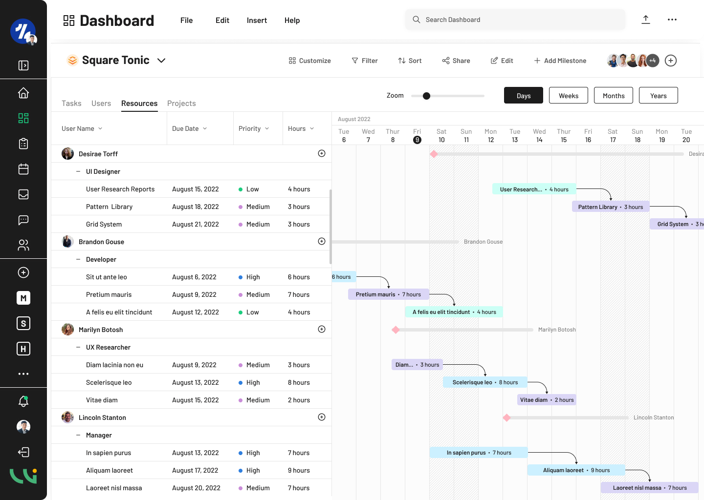
Resource management is defined as materials, equipment, and human resources to finish tasks all while being managed. Monitoring and tracking performance throughout a project is an important role for the project manager. The third Gantt Chart template, Gantt – Resources table chart contains the individual User, Due Date, Priority, and Hours. The schedule components per user contain the title of their task and the hours it will take to complete that task.
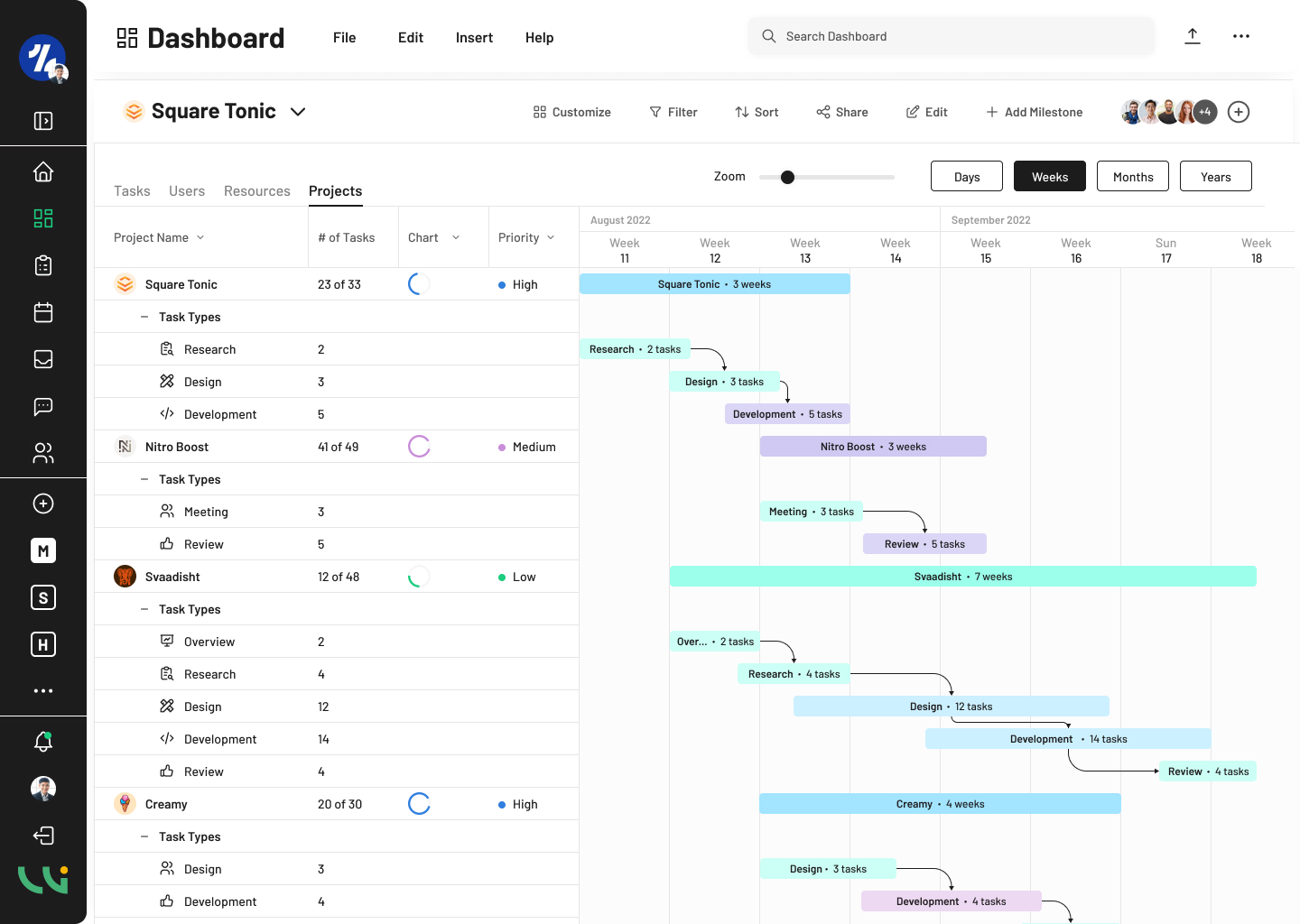
The final Gantt Chart, Gant – Projects include every project within that team’s schedule, whether current or upcoming. The table includes the Project Name, Number of Tasks, a Percent Visual, and Priority. The schedule components contain the Project’s name and the amount of time the team has to complete the project. Each Gantt Chart template is important for the individual user, team, or project manager because it is how to best manage their projects.
Westland, J. (2022, March 8). Resource Management: Process, Tools & Techniques. ProjectManager. https://www.projectmanager.com/blog/quick-guide-resource-management
Ultimate Guide to Gantt Charts. ProjectManager. (2022, December 15). Retrieved February 2, 2023, from https://www.projectmanager.com/guides/gantt-chart
Gantt • October
Gantt Tasks • Days
Gantt Tasks • Weeks
Gantt Tasks - Months
Gantt Tasks • Years
Gantt • Users
Gantt • Resources
Gantt • Projects
Kanban Boards
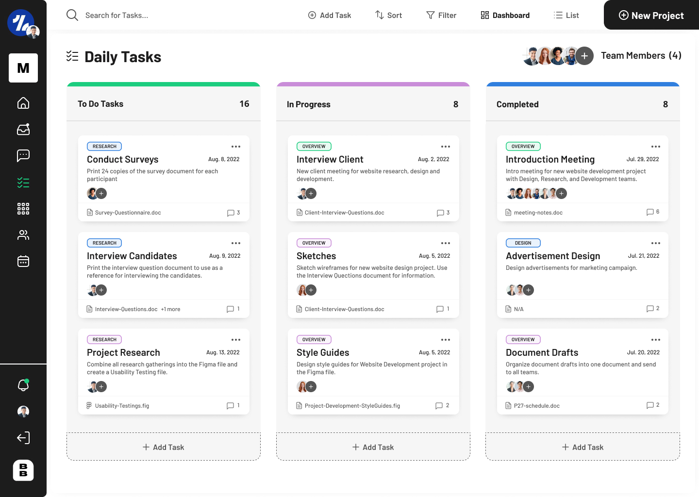
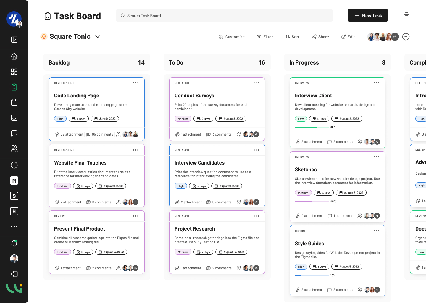
The Kanban Board is a tool that helps users view work visually, limit working progress, maximize efficiency flow, and helps both teams establish work. The board contains cards and columns. Each column contains one progressor such as, To Do, In Progress, and Completed. Each card contains the task that is placed in one of the columns. In the initial design, Tasks – October users are able to track their tasks with 3 columns. In the menu above, users are able to add new tasks and sort the information. Each card contains the project’s phase, description, to whom it is assigned, and any files or comments. These cards can be dragged to their next phase.
The initial design compared to the revised design, Tasks – October lacked a clean and modern look. The harsh gray background behind the cards made the design feel unfinished. I wanted the revised design, Tasks – January to be ridden of the repetitiveness that the initial design had and lighten up the background with color. The user doesn’t want to feel overwhelmed from the design when they are most likely overwhelmed with the amount of tasks they have.
When designing the New Task forms, I went with a step by step route for the user. The form begins with the user filling out the task name and description. . Users can choose the client based on whether the client has already been introduced to the company. The user can then add members to whom is assigned to the task. The user will then fill out the due dates and attach any necessary files. Users can view the comments by clicking on the comment icon. Users can also download any files by clicking on the paperclip icon. In the video below, users will be taken through the steps to fill out the task.
Tasks • October
Tasks • January
Tasks • New Task
Calendars
When designing the calendar for the initial design, Calendar – October, I wanted to use a simple monthly calendar that would provide all the user’s tasks and events in one screen. The user can easily look at a date on the calendar and view the task or even for the day with the appropriate time and user assigned. The initial design uses harsh strokes to outline the calendar table and the final design eased up on that harsh black stroke to a more calming light gray. Users are also able to view the calendar by day, week, and year aside from the month view.
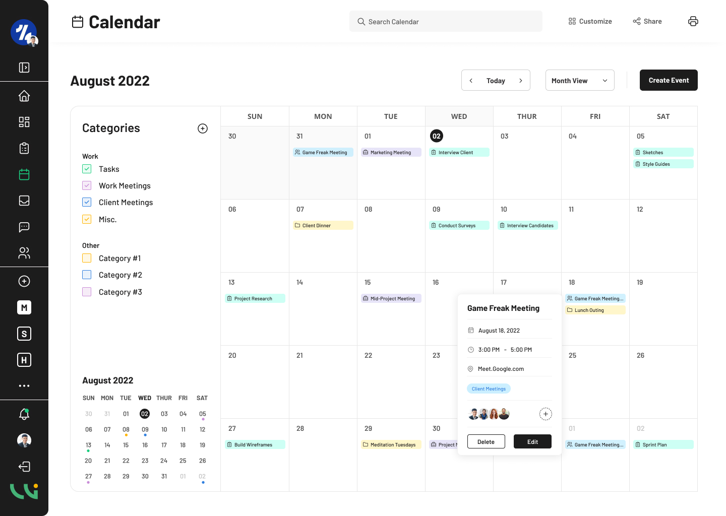
For the second part of the design, Calendar – November, I lightened up the harsh strokes which provided more attention to the tasks in view. However, upon entering the final design of the calendar, Calendar – January, I changed many of the original components to have a more modern and clean style. I added options for the user to be able to customize the calendar, as well as share the calendar from that page. I added an option for the user to create an event and changed the multiple views to a drop down menu which really cleaned up the original style.
I simplified the tasks in the calendar table. When the user clicks on the task, a frame will popup that allows the user to see the task or event in more depth. To the very left of the calendar, I added sort options for the user to filter out any categories they do not wish to view. The user also has an option to add a new category. I lightened up the color on the tasks and categories to bring in more calm and less intense colors. Finally, I added a miniature calendar in the bottom of the left side for when users browse through the calendar’s different views or templates.
Calendar • October
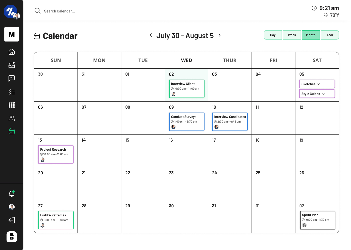
Calendar • November
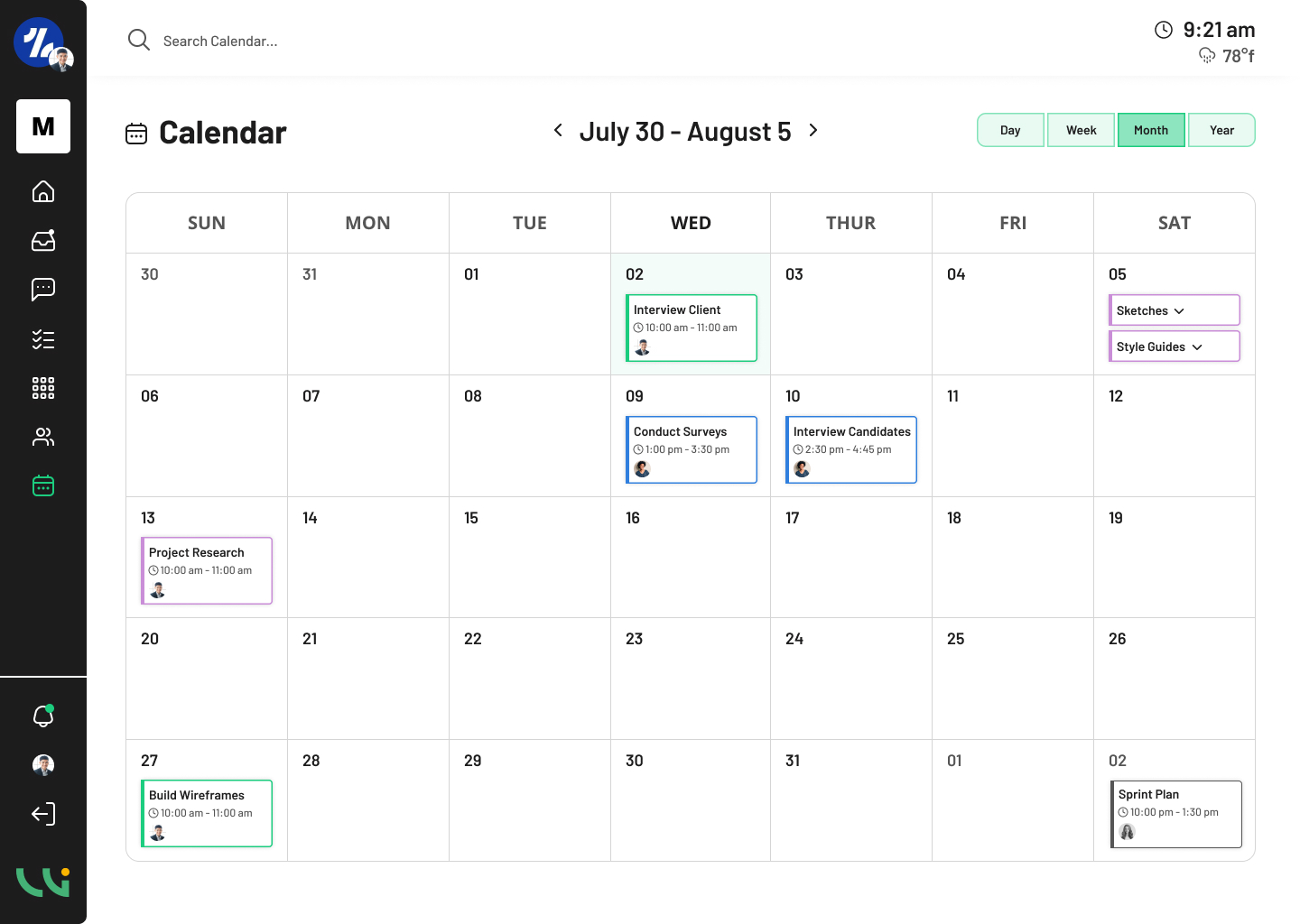
Calendar • January
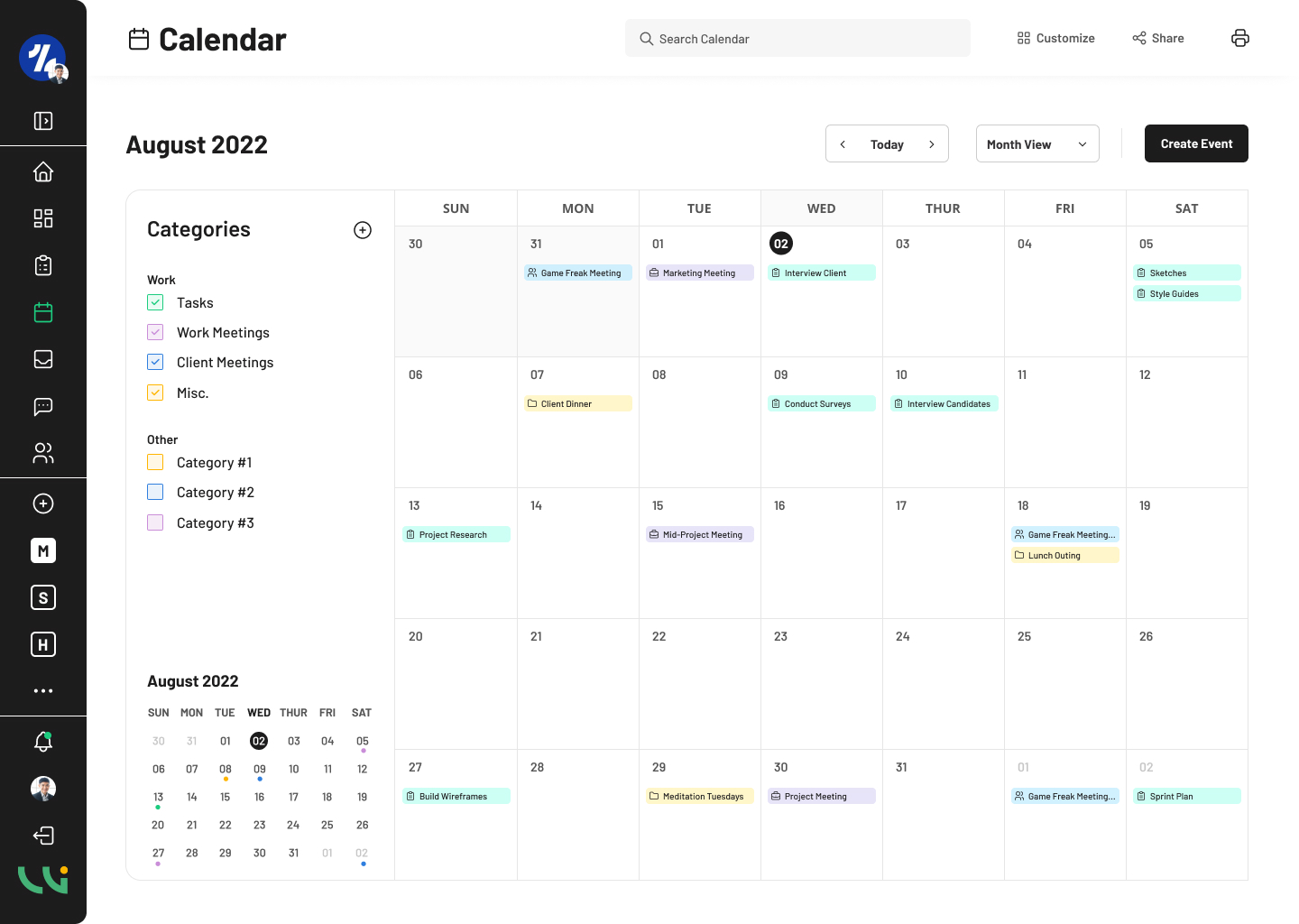
Calendar • Category
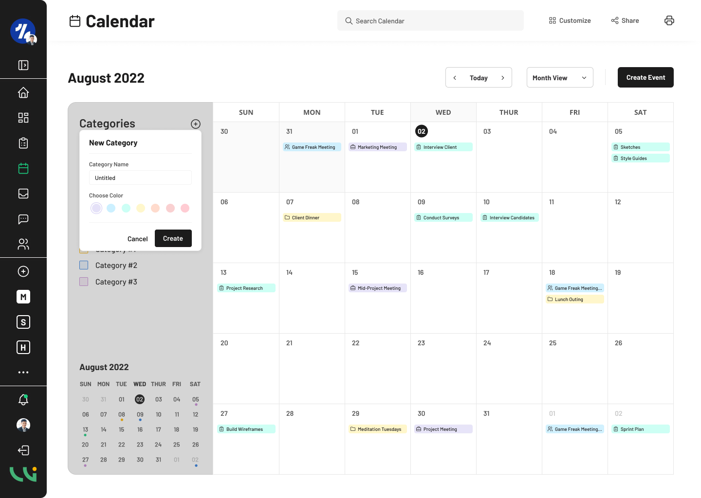
Calendar • Create Event
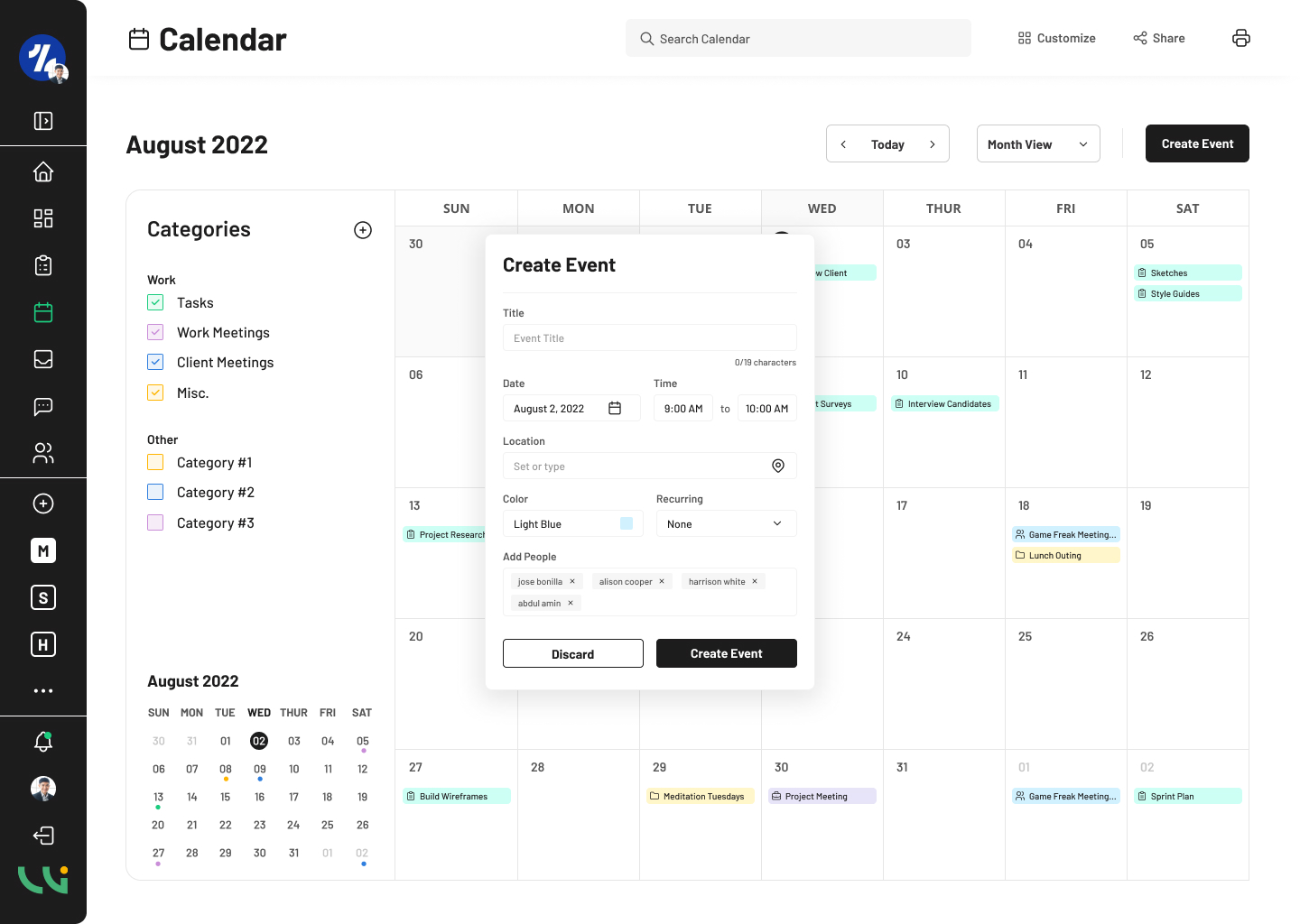
Calendar • View Event
Inbox
The next step to designing Workarise’s project management software is the Inbox and messaging system. I designed the Inbox component of the platform while another designer took on the Messaging feature. When designing the Inbox, I started by browsing multiple email services such as, Gmail and Outlook. I wanted to figure out what was necessary when designing an Inbox service. I began designing the Inbox’s menu. I included Folders and Labels as a way for users to sort their mail. Above the message in the initial design, I included options for users to move messages to a folder and add to a folder. I found two of those option were repetitive. In the final design, I filtered out those two option to one option, while also adding an option for users to label the message.
The initial design lacked a solid grid system that I then put in place in the final design. I cleaned up the inbox menu and replaced icons from the menu to match the icons from the email menu. In the final design, I really thought about how useful each element to the design would be for the user. It helped to browse active and working email platforms to figure out which information is necessary to have in the final design, making the final design clean and simple and useful for the user.
Inbox • Initial Design
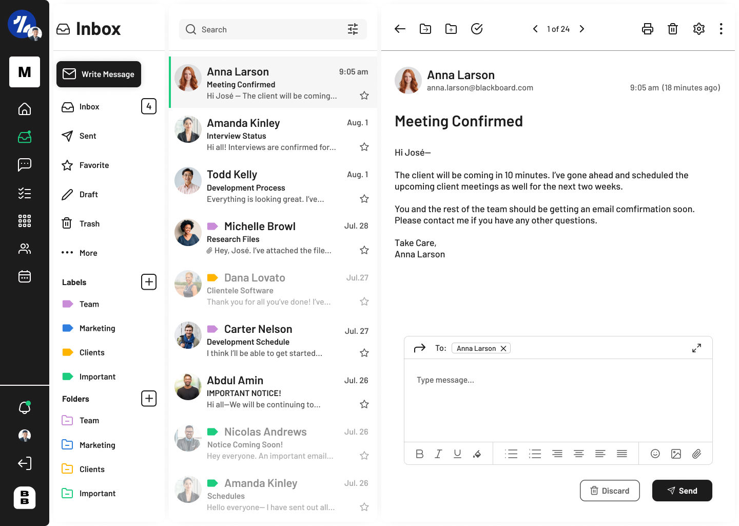
Inbox • Final Design
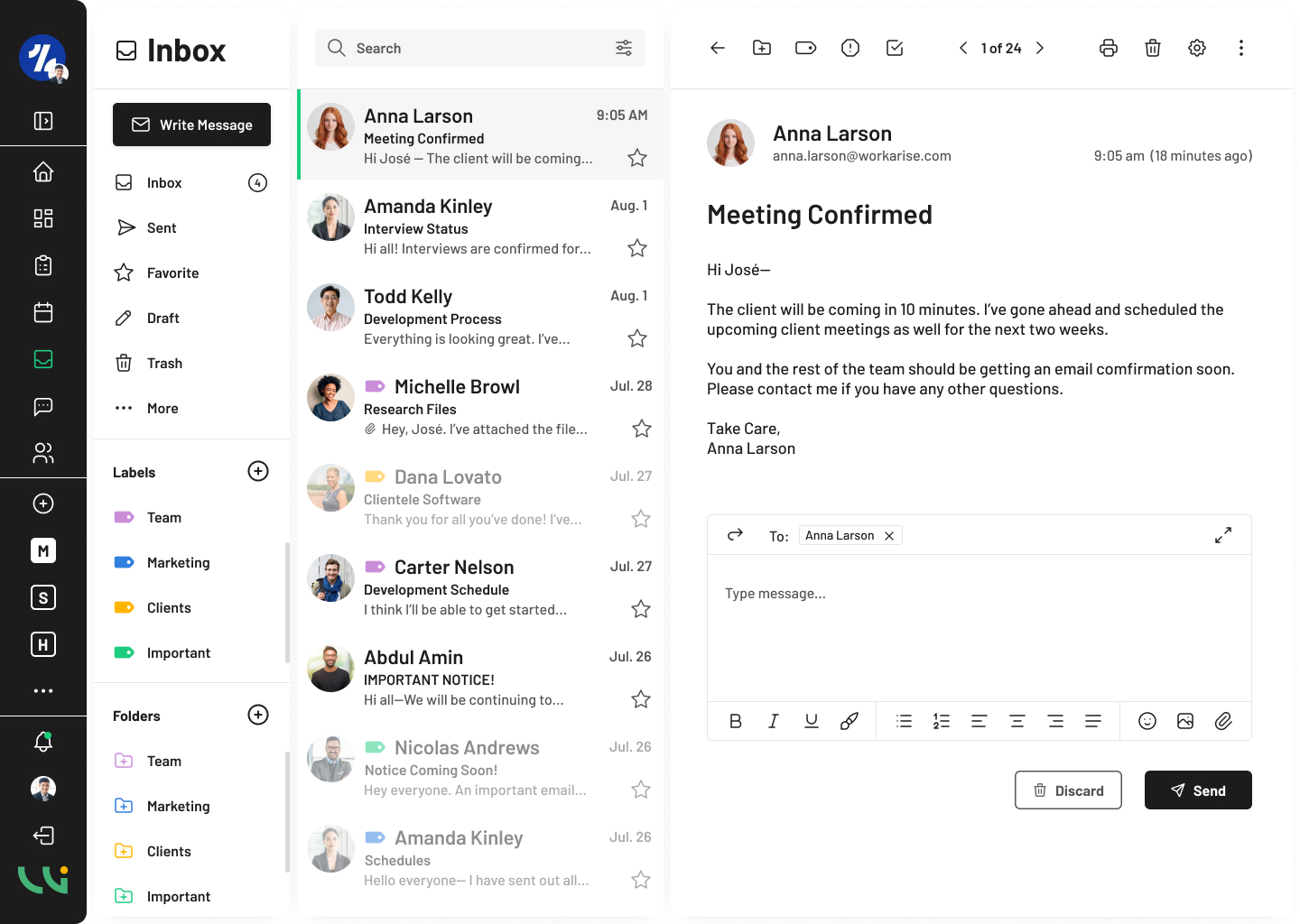
Team Members
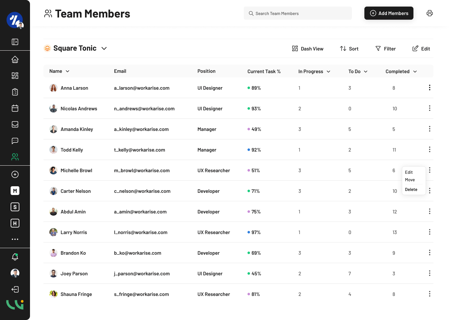
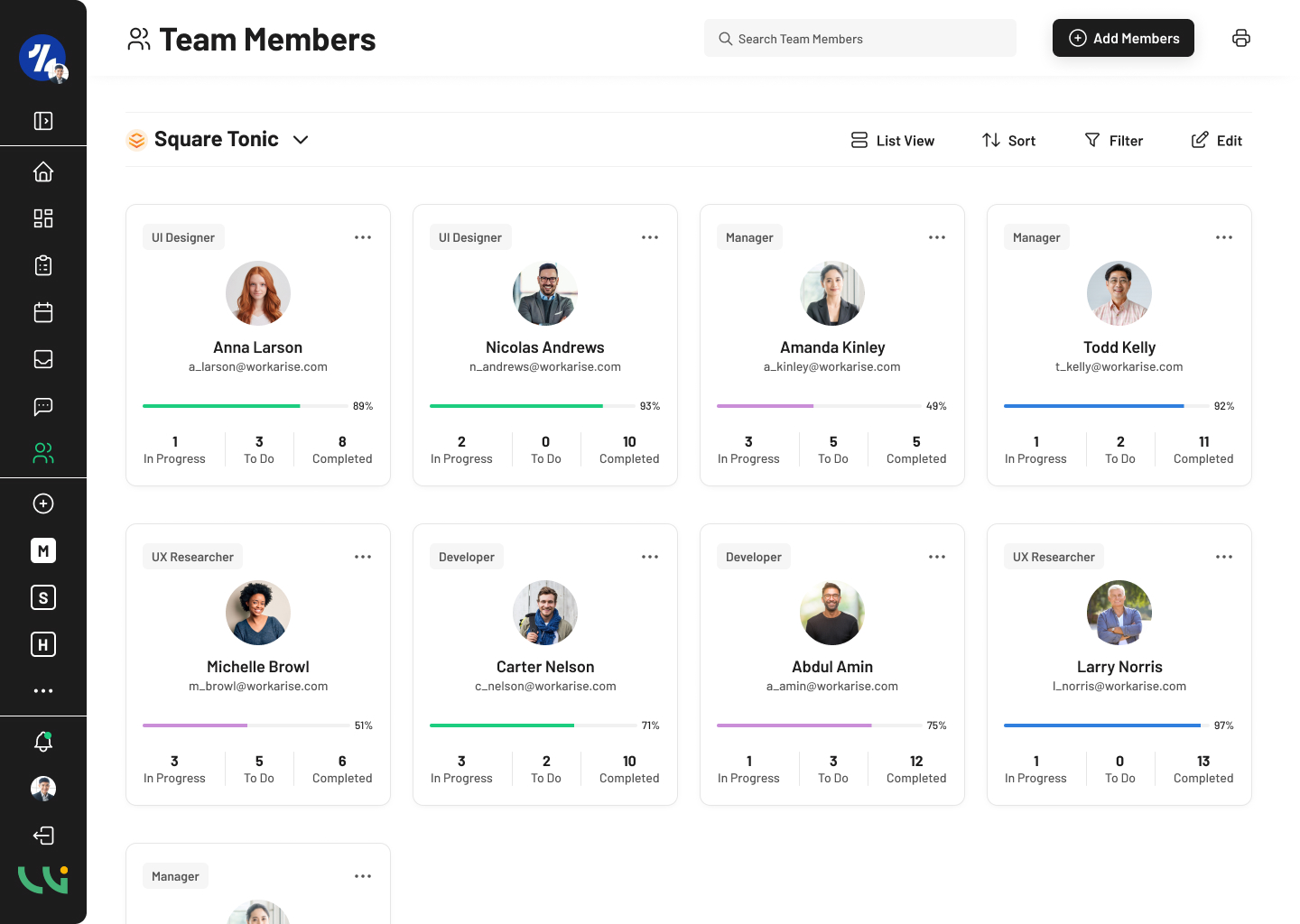
The Team Members screen in Workarise is for coworkers and managers to view and manage the staff of their project’s team. A team member page usually includes information from the team members roles, responsibilities, and contact information. Workarise’s team members page includes a card and list view, which allows users to view information in a more visually appealing format.
Including both a card and list view is important for organization. The list view is clear and has an organized overview which makes it easier for users to find specific information and track the user’s progress for tasks or projects.
Customization is another important criteria as users can sort and filter team members based on their specific position or project.
The card view allows users to view a visual representation of each team member’s information, which makes it more accessible for users who may not be familiar with sorting through list views or project management software. Including a Team Members page plays a crucial part in users being able to easily communicate and collaborate amongst their tasks and projects.
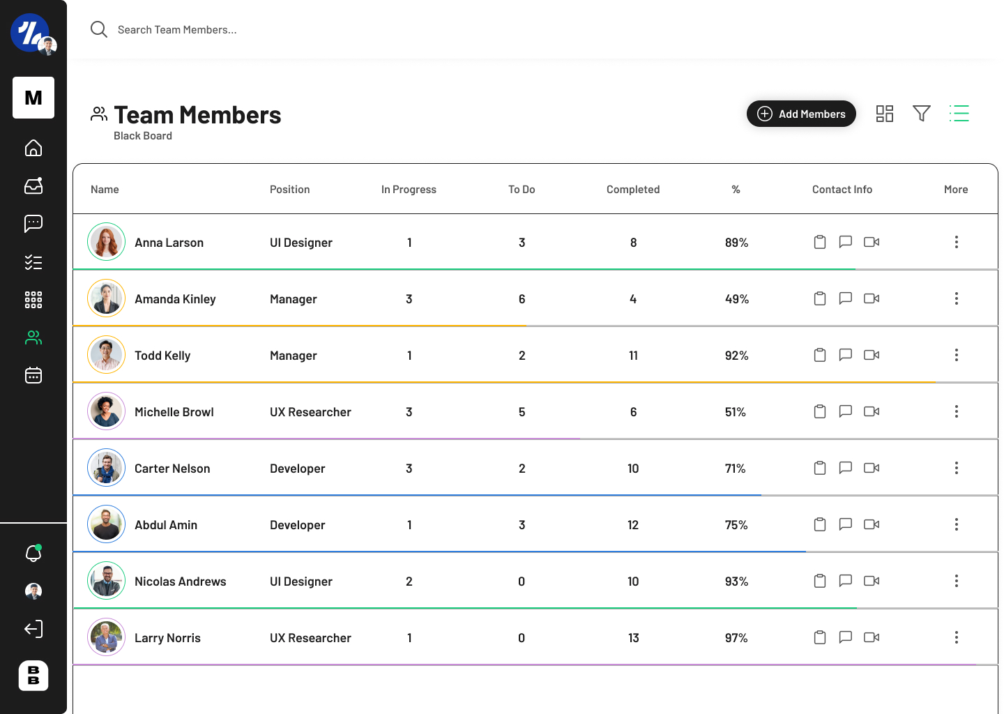
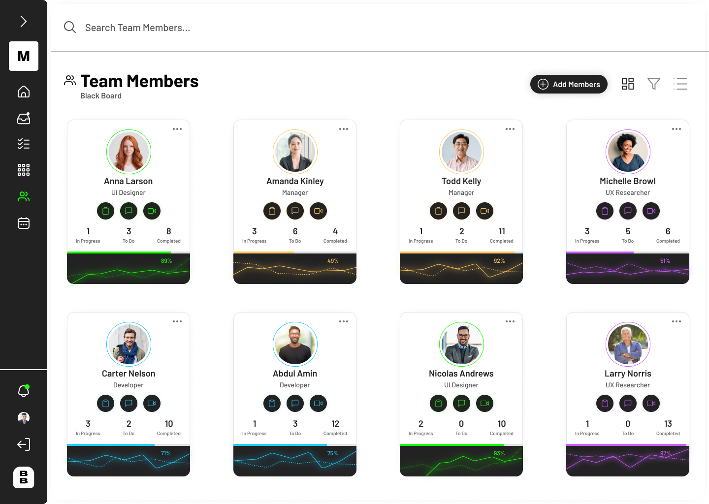
Team Members – Initial Design page included the name of the user, position, task progress, and contact information in the list view. The colored strokes portray the user’s task completion percentage. In more recent and final designs, the strokes were removed due to being too invasive to each user’s information. The card view includes all the information above but has different colored icons based on the user’s position (UI Design, UX Research, Manager, etc.) Due to accessibility reasons, I later changed the colored icons as it made it hard for the user to see,
I designed a second version of the card design that included a graph at the bottom of the user’s contact information. While I found the graph to be visually appealing, the information stood out as unnecessary as the information would be better written than having the users read each user’s graph.
For the final design, Team Members – Final Design, I lightened up the design and included the following information: name of user, email, position, task percent, and task progress. Users are able to sort and filter the list view information as well. The card view was a major improvement to the initial flawed design. The position is more clear and the graph slider is more appealing to the eye.
Team List • October
Team Cards • October
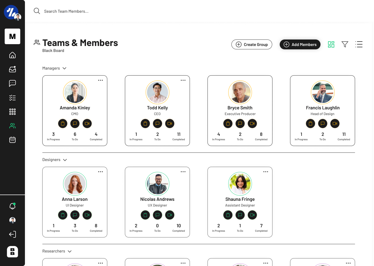
Team Cards • November
Team List • Final Design
Team Cards • Final Design
Takeaways and Next Steps
As an entry level UX/UI Designer, I was tasked with designing a project management software for the company, Workarise. I started working for Workarise in the middle of August and from there I designed the style and theme of the software. While I was not the only designer working for Workarise, I designed much of the platform given my experience with UI design and the approval of my designs from my manager. This project was a unique and challenging experience that allowed me to grow and develop my skills as a designer.
Throughout this process, I learned a great deal about the user centered design approach and the importance of conducting thorough research that allowed me to understand the needs and wants the owner of Workarise and my target audience. However, I also encountered struggles with designing a solid design system early on into the project. I struggled working with another designer when collaborating because they did not seem to put much effort into improving their current designs and appear enthusiastic about the approach.
Despite these challenges, I was able to take lead during the design phase and I was promoted to lead the design team and my manager put me in charge of approving the designs. I was able to apply my knowledge of user-centered design principles to create a user-friendly and intuitive interface, while also complying through accessibility standards throughout the process.
One of my key takeaways from this project was understanding the importance of the user’s needs and considering them throughout this design process. I learned about the importance of collaboration and communication with my other coworker and the developers.
While Workarise, the project management software is not complete and I have much more to design, this experience has so far been a valuable learning experience that allowed me to grow as a UX/UI Designer. I am grateful for the opportunity to apply my skills and knowledge in a real-world setting and I look forward to taking on more projects in the future. I have much more to design such as implementing collaboration tools and a tool to generate reports which is something I am very much looking forward to.