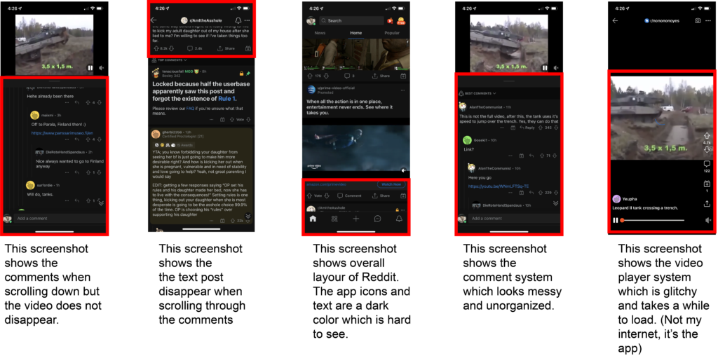
Reddit App Critique
Facebook's Initial Interview Guide (Pg.4)
***Screenshots on Bottom of Page
The objective of Reddit is to be used as a social media platform where users can post images, videos, and written posts about everything. Reddit is divided by subreddits that allow users to post to certain places based on the content. For example, r/aww is for cute things like animals and r/AskReddit is for users to post questions and receive various answers based on each individual’s answer.
Reddit’s video player needs improvement because it is slow and glitchy. When you turn off the volume, the video pauses. If you turn up your volume when the video is muted, the video unmutes itself. I think Reddit needs a new video player overall. The design of the icons could also be improved because the colors of the icons are gray, while the background is black (dark mode is on). I think the icons could use a brighter color because they can be hard to see if your phone isn’t up close to your face. Sometimes posts can be slow to open as well so I think I’d make it so when you open a post, the comments aren’t the first thing you see which may be what makes opening the post slow for the user.
The overall UI is good, as in viewing the posts. However, I don’t like the layout of the comments. The menu bar is neat, but the placement of the icons is off. I don’t necessarily like that the search bar is at the very top of the screen and I feel it is too small.
Areas where the app will grow overtime definitely come through to the video player. I don’t like the overall design or use of the video player, but those could always be improved. Notification systems could also always be improved because sometimes you get notifications for things you didn’t agree to.
The poorly executed parts of the app are in the video player and comments. I’ve discussed why I don’t like the video player and the comments are another mess I found in the app. The comments appear when you don’t want to see them. Meaning you open a post, and the comments jump right in front of you. I don’t like the layout of the comments because I find it messy.
The purpose of Reddit is to be used as a social media platform for people to talk and post about anything. Users can show what they like or dislike by upvoting or downvoting other users’ posts.
The competitors of reddit are Tumblr, which is another social media platform, but the user’s pages are called blogs. Tumblr and Reddit are similar because they both use followers, there are posts and pages about almost everything, and use a similar like-to-dislike system. Tumblr and Reddit are also both free to use but Tumblr is a bit easier to use, because users scroll down one Home page, whereas in Reddit there are home pages for the user’s own preference, news, and popular content.
The visual design of Reddit has good and bad visual design components. I’d say the good visual design components come through to the overall organization and structure of the placement of posts. Users can easily point out the different types of posts. Images are large enough to take up the whole screen, which can be challenging in other types of social media platforms when posts are small on mobile. The navigation bar is easy to read and the icons are placed accordingly. The bad visual design components come to be the colors of the icons and comment placement. The icons colors are a bit hard to see, as they are gray on a black background (viewed in dark mode). When viewed in normal mode, the icons are still that same gray except on a white background. I browse in dark mode, because the light mode can be a bit harsh on the eyes. The comments placement is another example of bad visual design, because they are too squashed together making it a bit difficult for the user to read.
The interaction design structure of the app is pretty solid in terms of scrolling through the app. Users can slide left or right to view News and Popular content. Scrolling down the user’s feed is easy to do and does not glitch or slow down. This is the same for comments as well. The flow and navigation system of Reddit is hard to critique because I feel that everything flows together pretty smoothly. One critique on the scrolling system is in the comments section of a video post. When users scroll down on a video post to view the comments, the video stays in place, whereas when scrolling down an image or text post, the image or text disappears when scrolling down to read the comments. I’d either change video posts to disappear when scrolling or change image and text posts to remain on screen when scrolling down posts. Overall, there’s always something that can be changed in any app. Reddit’s UX design system is fluid and has a good navigation system, but the colors of icons and text could be changed to be a bit brighter in color.